
Research guides · AAG RESEARCH GUIDE
Small business websites: a practical guide to better enquiries
Connect search intent, credible evidence, accessible forms and a dependable response. Includes a website blueprint, an illustrative funnel and a planning worksheet.

Short version
A useful business website helps the right person make a decision, complete a task and understand what happens next. Start with those three jobs before choosing a layout. Explain who the service suits, show credible evidence, answer practical questions and make the enquiry process reassuring. Measure useful enquiries and completed work rather than celebrating page views alone. A fast page, clear form and relevant project example should support the same customer journey. This guide gives small UK service businesses a practical method for joining those pieces together, including an illustrative enquiry funnel, a page blueprint and a downloadable worksheet. It draws on primary guidance from Google, W3C and the UK Government, while keeping published evidence separate from AAG's own recommendations. The examples are teaching scenarios, not claims about client results or guaranteed improvements.
Long version: make the website part of the service
A small business website often starts as a list of things the owner wants to say. There is a home page, a paragraph about the company, a services list and a contact form. Each part can be well written while the overall experience still leaves a visitor uncertain. The missing ingredient is usually a decision: what should this particular person be able to decide or do after arriving?
For a local repair company, that decision might be whether the business handles a particular fault and serves the customer's area. For a consultancy, it might be whether a problem deserves a paid discovery conversation. For a hospitality venue, the task may be much simpler: understand the offer, check practical information and make a booking through the correct channel.
These are different website problems. Treating all of them as a request for a dramatic homepage can produce an attractive opening that does little useful work. Our approach is to connect the public page to the actual service behind it. The visitor's question, the evidence on the page, the call to action and the team's response should agree.
1. Separate discovery, confidence and action
We use three questions when planning a service page. Can the right person find it? Can they decide whether it is relevant? Can they take the next step without confusion? Each question requires different evidence.
Discovery involves the language customers use and the way pages are organised. Confidence comes from an accurate explanation of scope, constraints, people, examples and practical details. Action needs an appropriate route, such as requesting a quote or checking availability. A page that performs only the last job can feel pushy. A page that performs only the first two may leave interested visitors stranded.
Write one sentence for each job before drafting the page. For example: people searching for a local commercial cleaning service should find this page; they should understand which premises we cover and how quotations work; they should be able to request a site assessment. This becomes a useful review test because it describes an outcome instead of a visual preference.
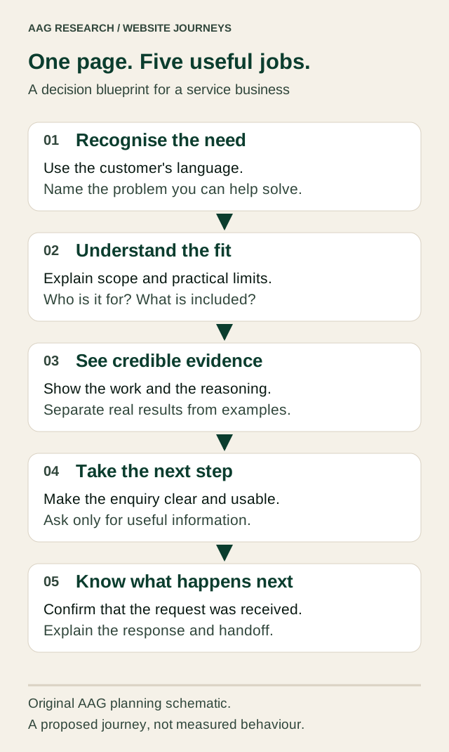
Original AAG planning schematic. It describes a proposed decision journey, not measured customer behaviour.
2. Start with questions from real conversations
Useful source material already exists in a small business. It lives in messages, enquiries, abandoned quotations and the explanations staff repeat. Collect questions without copying personal details into a public document. Group them by the decision they help someone make: suitability, cost, timing, preparation, trust or what happens afterwards.
Do not convert every message into a separate webpage. Several questions may belong together. A service page might need a concise section on typical scope, a worked example of the process and a clear explanation of information required for a quotation. The aim is to reduce uncertainty at the point where it matters.
Record the questions customers ask after reading the current website. These are especially revealing. If nearly every enquiry asks whether a particular service is available, the page may be unclear even when the answer technically appears somewhere. Findability is part of the answer. A paragraph hidden beneath several unrelated sections is not doing the same job as a precise explanation near the service description.
3. Match the page to the visitor's level of knowledge
An owner searching for a replacement website may know exactly what they want. Someone searching for a way to stop answering the same customer questions may not yet know that website content is part of the solution. Those visitors need different entry points.
A service page can explain the offer and next step. A practical guide can help someone recognise the underlying problem. A project profile can show how choices fit together in a specific setting. Link these pages deliberately. The guide should help the reader continue to a relevant service, while the service should provide a project example for someone who wants more confidence.
Avoid forcing the same sales message into every paragraph. Readers can notice when useful advice stops to become repeated promotion. A stronger connection is concrete: if the guide explains appointment enquiries, the related example should demonstrate the relevant information flow. Relevance provides the connection without making every page sound identical.
4. Define a qualified enquiry before measuring conversion
More submissions do not necessarily mean better business. A form can attract spam, requests outside the service area or people seeking something the company does not offer. Decide what makes an enquiry useful before evaluating a change.
A simple definition might require a relevant service, a usable contact method and enough context for the team to respond. Avoid demanding a full project specification from someone who is still exploring. Qualification should help the conversation start, not make the visitor do the consultant's job.
Keep the stages separate: enquiry received, enquiry relevant, discussion held, proposal requested and work agreed. The website influences these stages but does not control all of them. Availability, price, fit and the quality of the response also matter. This prevents an attractive dashboard from encouraging the wrong behaviour, such as maximising form submissions while ignoring whether anyone receives a useful answer.
5. Put evidence beside the claim it supports
Evidence is strongest when a reader can see exactly what it proves. A screenshot can demonstrate that an interface exists. It cannot prove that the customer saved ten hours per week. A client quotation can express an experience, but it needs permission and must not be edited into a stronger claim than the client made.
Build project profiles around a clear boundary: the situation, the problem in scope, the work delivered, the decisions made and what can be demonstrated. Where measured outcomes are unavailable, show the behaviour of the solution. Explain how a record is found, how a request moves between people or how a customer understands the next step.
Use permissioned photographs, original diagrams and carefully redacted examples. Avoid visible account details, private correspondence or screenshots that expose other customers. A useful case study does not need confidential commercial information. It needs enough honest detail to make the design decisions intelligible.
6. Give visual material a specific job
A banner image should establish context or show the work. If it is decorative, its visual weight should match that limited purpose. An unrelated stock photograph can occupy the most valuable space on the page while answering none of the visitor's questions.
Choose graphics according to the explanation needed. A photograph can show a place or physical service. An interface image can demonstrate a real product. A schematic can explain a process that would be difficult to photograph. A chart can compare values when meaningful data exists. A labelled conceptual illustration can make an abstract idea easier to understand, provided it is not presented as a real client deliverable.
Add captions that say what the reader is looking at and why it matters. If a diagram is illustrative, say so beside it. If an image shows an early prototype, identify its status. These small distinctions make a site more credible because the reader does not have to guess what is real, proposed or measured.
7. Treat search intent as a planning input
Keyword work begins with the service and the customer's question. Useful groups might include the service itself, the location genuinely served, the problem being solved and a comparison someone needs to make. A Birmingham business systems provider could reasonably explain bespoke business systems, CRM integration and spreadsheet replacement, provided each page offers a distinct answer.
Do not produce many near-identical location pages that merely swap a place name. A location page should contain useful, accurate local context, such as actual service availability and relevant examples. Likewise, a comparison guide needs a balanced explanation of when each option fits. Its purpose is to help a decision, not repeatedly restate the same keyword.
Google's people-first content guidance emphasises original value and explicitly rejects the idea of a preferred word count. Our take is practical: write enough to answer the task thoroughly, then remove repetition. A long guide and a short service page can both be appropriate when their purposes differ.
8. Make local details accurate and useful
Visitors need to know whether a service is available to them. State the genuine service area and distinguish a registered office from a place customers can visit. Publish appointment or opening arrangements only when they are operationally correct. Inconsistent information creates avoidable uncertainty even when the visual design is strong.
Structured data can describe supported business facts in a form search engines can interpret. It should reflect the visible page and the actual business. Do not add invented ratings or imply a walk-in location where none exists. Google's LocalBusiness documentation explains the supported information and makes clear that eligible markup does not guarantee a search feature.
Consider the practical journey after a local search. A visitor may arrive directly on a service page, never see the homepage and use a phone while travelling. The page should therefore stand on its own: what the business does, where it works, how to make contact and what to expect should not depend on exploring the whole navigation.
9. Build the contact form around the first useful reply
For each field, ask who uses the answer and what they do with it. Name and email may be enough for an initial conversation. A service choice can help route the enquiry. A long mandatory questionnaire may be appropriate for a detailed quotation but excessive for a general question.
Use clear labels, visible instructions and errors that explain how to correct the problem. W3C's forms tutorial connects accessible labels, structure and feedback with people being able to understand and complete forms. This is part of the basic quality of the journey, not an optional polish step.
Test the form with a keyboard, on a narrow screen and after a failed submission. Preserve the person's input when recovery is possible. Do not make a browser error look like a successful enquiry. The public message must reflect what the server has actually accepted, and the business needs a dependable way to find that accepted request.
10. Design the moment after submission
A successful submission should create a clear change of state. Show a prominent confirmation with what was received, what happens next and the response expectation. If a reference exists, make it easy to keep. Offer a relevant next page without encouraging someone to send the same enquiry again.
The GOV.UK confirmation-page pattern is useful primary guidance for this moment: people need reassurance that the transaction is complete and a clear explanation of the next step. A commercial website can apply that principle without copying a government visual identity.
Response wording must match the operation. An aim is different from a guarantee, and a team should be able to meet the expectation it publishes. If an acknowledgement email is not actually sent, do not say that it has been. Confidence comes from an accurate promise followed by the expected action, not from increasingly enthusiastic thank-you messages.
11. Measure a journey without pretending the data is complete
Choose a small set of measures that answer business questions. Search impressions can indicate whether pages are being shown. Visits can indicate arrival. Enquiries can show expressed interest. Qualified enquiries and agreed work help connect the website to a commercial result.
Each measure has limits. Consent choices, blocked scripts, repeat visits and different definitions can change recorded totals. Search tools also describe a different part of the journey from internal enquiry records. Do not silently join incompatible numbers and present the result as a precise funnel.
For a small business, an anonymised enquiry log can be useful even without visitor tracking. Record the date, broad service interest, whether the request was relevant and its eventual status. Collect only what has a clear purpose and handle personal information appropriately. A consistent, modest dataset is more useful than a complicated report nobody can explain.
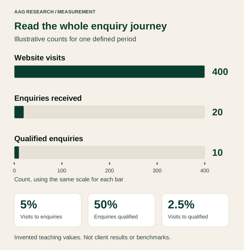
Illustrative arithmetic only. These are invented teaching values, not AAG results, a client result or an industry benchmark.
12. Read the funnel carefully
Suppose an illustrative website receives 400 visits, 20 enquiries and 10 qualified enquiries during one defined period. Enquiries divided by visits gives 5%. Qualified enquiries divided by all enquiries gives 50%. Qualified enquiries divided by visits gives 2.5%. These describe different questions, so a report should not label all three simply as conversion.
Now imagine a clearer service description reduces irrelevant requests. Total enquiries could fall while the number of qualified enquiries stays the same. The business may receive a more useful workload even though one headline number looks worse. Conversely, a very restrictive form could improve the apparent qualification rate while preventing suitable people from contacting the team.
The right interpretation comes from reviewing actual requests and observed behaviour. Use the numbers to locate a question, then investigate it. Never assume that a higher percentage proves the website improved if traffic sources, the offer or the definition of a qualified enquiry changed at the same time.
13. Improve performance where people feel it
A page can look excellent on the designer's machine and still be awkward on a visitor's phone. Oversized images, delayed interactions and shifting content can interrupt the task. Performance should be considered when choosing media and page structure, not left until everything else is finished.
Google's Web Vitals guidance describes loading, interaction and visual stability through LCP, INP and CLS. Its good-experience thresholds are LCP at or below 2.5 seconds, INP at or below 200 milliseconds and CLS at or below 0.1, assessed at the 75th percentile. A laboratory test is useful for diagnosis but is not a substitute for sufficient real-user field evidence.
Our practical review starts with the largest visible image, the first meaningful content and the main action. Check whether the mobile page loads its useful information promptly, whether controls respond and whether the layout stays still while media appears. Avoid sacrificing readability simply to achieve a prettier numerical score.
14. Test decisions with people, not only software
Automated checks can find broken links and some accessibility issues. They cannot tell you whether a visitor understands the offer or trusts the explanation. Ask someone representative of the intended audience to complete a realistic task without telling them which button to press.
For example: you manage a small venue and want to know whether this company can help organise booking enquiries. Ask the participant to decide whether the service is suitable and explain what they expect after contacting the company. Observe hesitation and interpretation rather than asking whether they like the design.
The GOV.UK moderated usability-testing guidance recommends believable tasks with clear goals that do not reveal the answer. Our adaptation for a small commercial site is a short, focused session with a few important tasks. Keep notes on the exact point of confusion, change that part and check whether the explanation now works.
15. Avoid false certainty from small samples
A low-traffic site may not have enough observations to distinguish a real improvement from ordinary variation. Two enquiries instead of one can look like a dramatic percentage increase while telling you little about what will happen next month. Report the counts alongside any rates.
Use a sequence of small, explainable changes. First repair a broken form or unclear offer. Then improve evidence and the next step. Keep a dated note of what changed and why. Where possible, avoid changing the entire proposition, design, traffic source and pricing simultaneously, because it becomes difficult to learn which part helped.
This does not mean waiting indefinitely for perfect data. Obvious friction can be removed through direct observation and careful testing. The distinction is between making a sensible improvement and claiming a measured commercial effect. You can confidently say that the form now preserves entered information without claiming that it increased sales by an unsupported percentage.
16. Turn the website into a maintained business asset
Assign a named owner to information that changes: service availability, contact details, response expectations, project status and downloads. A content management system helps someone edit a page, but it does not decide whether the information is correct.
Keep a small review record with the page, the claim being checked, the person responsible and the date. Give extra attention to time-sensitive statements and external links. If a service is no longer offered, update its page and its related calls to action together. If a project is still a prototype, retain that label when adding new images.
The UK Business Data Survey 2024 estimated that 68% of UK businesses had a website. That describes presence, not effectiveness. The useful competitive question is what a visitor can accomplish on yours and whether the business reliably completes the promised next step.
AAG's take: clarity is a complete chain
Our position is that conversion work should connect the public experience to the operating reality. Search wording brings the right question. A useful page answers it. Appropriate evidence builds confidence. A dependable form starts the conversation. A clear internal handoff makes the promise real.
Start with one important service journey and make that chain understandable from beginning to end. Then apply what you learn to the rest of the website. This gives a small business a practical improvement programme without pretending that every page needs the same length, imagery or call to action.
Download and use the worksheet
Download the website journey worksheet. It includes a page-purpose brief, an evidence inventory, a form review and a simple measurement record. Use a separate copy for each important customer task.
For a related explanation of the work behind the enquiry, read our workflow automation and CRM integration guide. Explore AAG website services if you need help connecting content, design and operation.
A practical page review checklist
- The first screen names the service and the intended customer.
- Scope, location and the next step are easy to find.
- Each important claim has suitable evidence and permission.
- Images explain something and have useful alternative text.
- The form works on a phone and with a keyboard.
- Confirmation describes the actual next step.
- The responsible person can find and answer accepted enquiries.
- Measurement definitions and content owners are recorded.
Sources and further reading
Reviewed 13 October 2026. This is an AAG practical guide informed by the primary sources below. It is not an academic paper, an accredited qualification or an endorsement by the named organisations. Original examples and diagrams are labelled; no client performance data is presented. External guidance can change.
- Google Search Central, Creating helpful, reliable, people-first content, updated 5 October 2026. Primary search-publishing guidance, not a promise of rankings.
- Google Search Central, LocalBusiness structured data, reviewed 13 October 2026. Technical documentation for eligible business information.
- Philip Walton, Google web.dev, Web Vitals, updated 31 October 2024. Primary metric definitions and thresholds.
- W3C Web Accessibility Initiative, Forms tutorial, updated 27 March 2026. Guidance from the organisation that develops web accessibility standards; citing it does not certify this guide or another website.
- GOV.UK Design System, Confirmation pages, reviewed 13 October 2026. A public-service design pattern adapted here as a general design principle.
- Government Digital Service, Using moderated usability testing, reviewed 13 October 2026. Primary service-research guidance.
- Department for Science, Innovation and Technology, UK Business Data Survey 2024, published 27 June 2024. Ipsos fieldwork involved 3,911 UK businesses between October 2023 and February 2024; the website estimate is population research, not evidence about AAG clients.
KEEP EXPLORING
Another useful perspective.

Research guides · 13 Oct 2026
Practical AI for UK small business: a controlled pilot blueprint
A practical guide to choosing a useful AI task, testing its quality, protecting information and measuring the full cost. Includes diagrams and a pilot worksheet.

Research guides · 13 Oct 2026
Workflow automation, CRM and integrations: a practical business guide
Choose what to automate, decide which system owns each record and make failures recoverable. Includes a process blueprint, transparent effort example and worksheet.

Hospitality systems · 13 Oct 2026
Hospitality queues and bookings: a practical customer-flow blueprint
A research-backed guide to restaurant bookings, walk-ins and digital waiting lists, with a service blueprint, queue examples and free pilot worksheets.